Comedy Posters
Posted on 04 November 2011
As a comedian one of your most important tools for selling yourself is your image. People need to be able to look at you and think a) funny and b) my style of funny. For this article I’m going to be focusing primarily on the image you project through your posters. Posters and their distribution are going to be one of the biggest financial investments you make to get your show off the ground, and you will want them done right.
Brainstorming
Your first step will be to think about what you want to project about yourself, and what your show is about. These are details you will need in mind before you start talking to photographers in order to better collaborate with them.
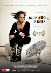
First and foremost you must remember that you are a comedian and that you need to project funny. You are not a rock god. You are not a sex idol. Though, you may bring elements of these to your show. Getting too caught up in the dark, mysterious, bad girl/boy image, you will lose the funny. Remember that Tim Minchin started out by MOCKING that image. He now embodies it to a certain extent, but he still tries to find ways to send it up.
Think about the sort of role you take on stage. Do you play the innocent? The mocking school child? The blustering idiot? The flirt? The put upon parent? What sort of clothes suit that role? What sort of props? Then think further about clothes and props in relation to the material you will be presenting in your show. What will best communicate your subject matter and your theme?
If you want to come off as a professional, make sure your clothes and props have a certain amount of polish. Even if they came from an op-shop (secondhand store), they will need to look crisp and in good condition or at least completely appropriate. Cheap and cheerful sounds like it will do the trick. It will look like your show is only half-baked and not ready for public presentation.
Good Photographer
Find a professional photographer with a studio, proper lighting and camera equipment, and experience. Make sure they have done work creating images for a wide variety of media: from CDs to community newspapers. Also make sure they are good at listening and at directing you to be your best. Anything less than this and you are wasting time and money.
Your friend up the street with the expensive camera cannot do it. A really good photo you took on your smartphone isn’t going to do it.
These may look good to you now, because you haven’t had much experience examining the subtleties that make a picture appear professional. However, once you compare it with something done by for instance James Penlidis who specialises in photographing comedians, you will sense the greater degree of clarity, precision, aesthetic balance, and projection.
Crossmedia experience is also essential. You will need your poster looking equally good on a blog as in a print newsletter. For instance if your photographer uses a lot of black, too much black has a tendency to bleed on cheap newsprint, thereby muddying the image. Also, if your figure is too small, you could disappear altogether when thumbnails are used in online media. A portrait or glamour photographer will not know these things.
Makeup…Even for Guys
I have to admit, I’m a little shaky on this one myself. I’m allergic to many of the chemicals that go into makeup and so have generally avoided the stuff. However with performance experience, I have become aware of its importance. I just have to buy more expensive, better quality goop.
The photographic process takes away some of your facial detail. As a comedian your two most important performance tools are your voice and your face. So, you will need to colour up your wares, so people can see what’s on offer. In particular you will need to define your eyes and lips, give yourself an even skin texture and a healthy glow. Anything beyond that has to do with the sort of character you are wanting to communicate.
I find it has been worth my while getting an experienced makeup artist who knows how to work for the camera. Ask to see their portfolio. If they have only done weddings, that’s better than nothing, but you want to see someone who has created advertising or art images.
A Conversation Worthy Photo
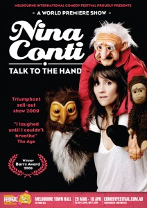
Comedy photos need to radiate more personal energy than any other performance image. Bands can get away without even showing their faces, just cover art. James Penlidis emphasizes that with comedy you should, “think in terms of movie posters with deliberate and specific staging.”
Your photographer and/or art director must have the people skills to effectively direct you into still scenarios that will jump off the page. Dynamic is best, but dynamic can simply be how expressive you can make your face.
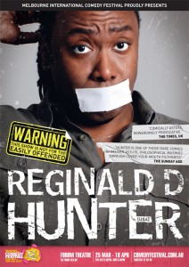
Also key is how readily people recognise the scenario as funny. In Reginald D. Hunter’s poster his mouth is covered with gaffer tape. However, his eyes are wide and his eyebrows arched in surprise, which is further elaborated upon by his scratching his head with one hand. In vivid yellow and black letters are the words “WARNING, this show is not for the easily offended.” This explains the tape. Reginald’s expression is clear enough to be funny in its own right. The poster has also been well designed to enhance that humour.
The Problem With Selling Too Much Sex
Sex does sell. People do like going to shows where they can enjoy the presence of someone they find sexually attractive. Young performers may take that and try to use it as their wedge to gain attention. Their posters may be provocative and lurid.
But a couple of caveats should be considered.
* Sex will get people through the door the first time you use it, but if you have nothing more to offer, especially in something that is purporting to be comedy, you will alienate your audience. Show some integrity in the relationship between your images and what you are actually offering.
* Sex will get people through the door, but are they the sort of people you want? The first venue I performed in largely served drunken hens and bucks nights. The smart humour, the imaginative humour, the subtle humour all died. What got laughs was simply shouting the word “tits!” I found this discouraging. People coming for a perv are also more likely to heckle.
If you are out to sell sex, then the finest article about effective images is at the OKCupid Blog.
It’s worth everyone having a read, since it provides insight into the psychology of photo attraction.
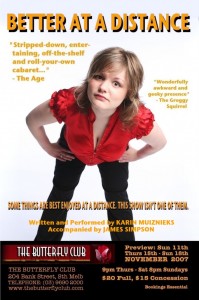 Karin Muiznieks—she’s doin’ it right
Recommendations, Reviews, and Awards
In the graphic design of your poster you will want to make sure your image remains clear, even with the addition of text. You will also want to make room to include a few recommendations, reviews, and awards.
Know who can drive people to your show and have them say something about you that you can print. If you have a connection to a big name comedian, get a quote from them (ask nicely, of course). Lawrence Looney-Tunes says, “Katherine makes me smile.” I’ve had a couple friends call me for words they could print. I treat it as a form of business reference. Fortunately, I have felt comfortable putting my name to their shows.
ANY reasonable reviews are worth touting. Going to live performance is a social act. People want to know they will be with other people who are having a good time. Reading a description of your show may pique their interest, seeing your poster may get them excited, but the clincher is going to be whether other people say it’s any good. Interestingly, the Word of Mouth on the Web site is taken with as much authority as an article in a big newspaper. Certain blogs have been fair game sources for quotes for some time.
Consistent Imagery
Once you have settled on an image for your show, then you need to consistently push that image with the media. Use the same image, with perhaps a few slight variations, for the festival guide, advertising, flyers, posters, Facebook, etc. Even for publicity appearances, ensure you are wearing the same clothing. This is about being memorable, memorable, memorable. If people see and remember you frequently enough, it’s like being famous and can get you famous. People look through the festival guide and think, “I’m sure I know this person and the show looks like fun. I think I shall buy a ticket.”
One final word. Start collecting the posters of your favourite comedians. Tack them up around your room. You can use them as inspiration for your own performance. You will also get used to the quality you need to sell your own show and recognise it when you start shopping around for photographers, art directors, graphic designers and artists.
Peace and kindness,
Katherine
2 responses to Comedy Posters


Are you saying I show too much sex or just enough? I’ve got all my clothes on and I’m pulling an ugly face. Is that sexy???
*hehehe* Well, if you read the OKCupid article about profile pictures, you have the PERFECT picture for attracting lovely young gentlemen.
The angle of your face is similar to a MySpace angle, you are showing a bit of cleavage, and you are doing something interesting and conversation worthy…a comedy show.